Like what you see?
Drop us an email at hello@solidaritystudio.uk
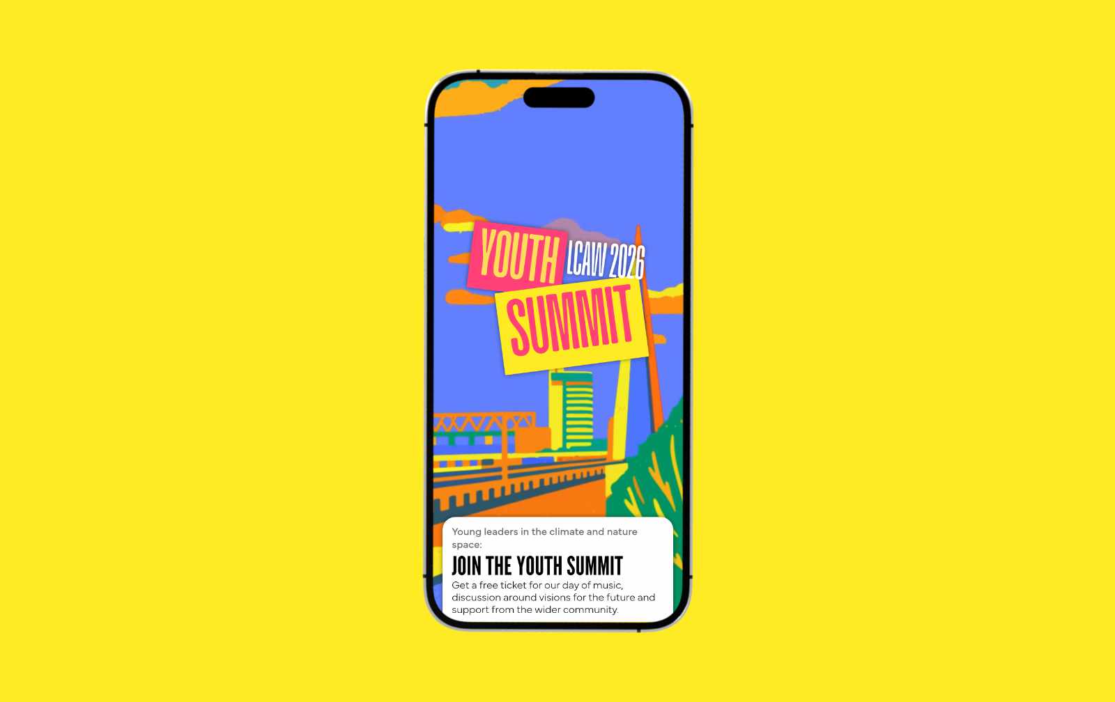

Youth Summit @ London Climate Action Week
Working with Earth Minutes, we created a digital platform for London Climate Action Week's first ever Youth Summit - delivering intergenerational spaces for young people and climate, business and public leaders to listen, learn, mobilise action and celebrate joy.
![Two angled printed flyers lying on a pale yellow surface. The top flyer is a yellow and black A5 with the headline "WORKERS POWER: ORGANISING TO WIN" over a photo of two women presenting at a flip chart to a small group of seated participants. Highlighted blocks of body text read "2-3 day course for trade union members to build empowered leaders and grow membership" and "Suitable for all levels of education, ideal for new members and those looking to get more involved." Beneath it the reverse of a second flyer is partly obscured by the top flyer, with visible text reading "LEARN HOW AND WIN F[or] WORKING [class]" as the heading, checklist items "Understand how [our economic system works], Learn working class [history], Get the skills and [confidence]", and an opening line "On average 1 in 3 of our". A pull-quote in bold reads "IT'S STRENGTHENED [the relationships] BETWEEN BRANCH[ES], MORE CAPACIT[Y] AND BUILT MOR[E] OUR CAMPAIGN[S]". A footer band shows a QR code, contact details "C4PE.ORG / INFO@C4PE.ORG", the "CENTRE FOR POPULAR EDUCATION" logo with an open-book icon, and the smaller line "The Centre for Popular Education is a project of the Rosa Luxemburg Stiftung London Office."](https://cdn.prod.website-files.com/6a08f1144d8b0919992131e1/6a08f249e0bbc44e5b56a0e9_image%20201.jpg)
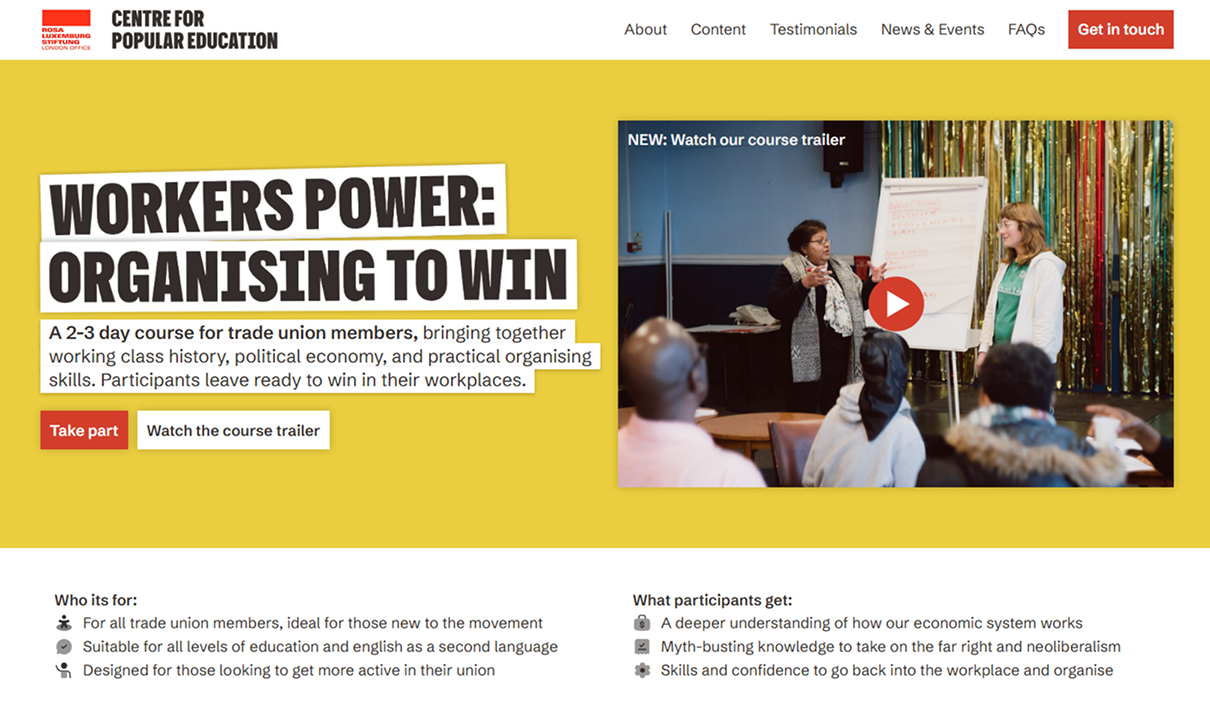
Centre for Popular Education
Working with the Rosa Luxemburg Foundation on a new workers education project, we developed branding inspired by trade union history, and a website to market the course to workers across the country.
"We loved working with Joe. He was really easy to communicate with and made the whole process feel very smooth.”
Deborah Hermanns, Rosa Luxemburg Stiftung

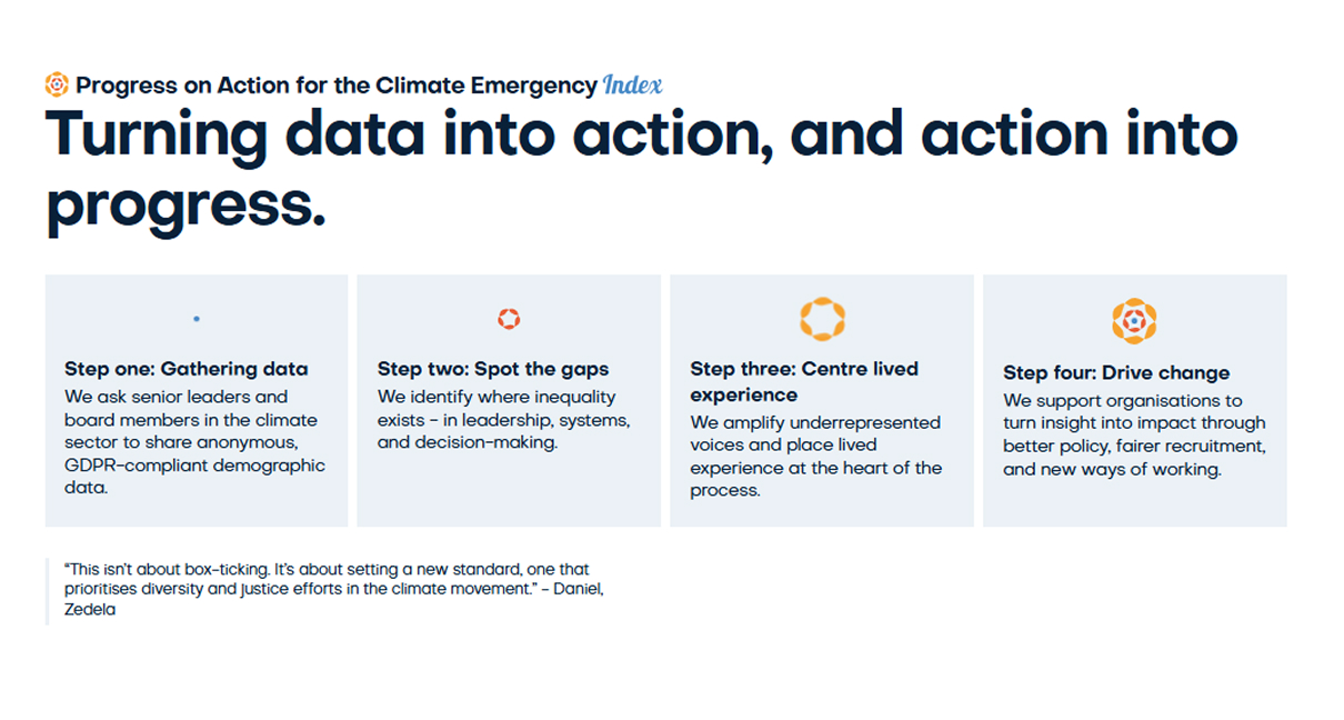
PACE Index
The European climate movement is lacking in diversity and PACE Index is using data to turn that around; we helped tell their story with a brand upgrade and custom website interactions.
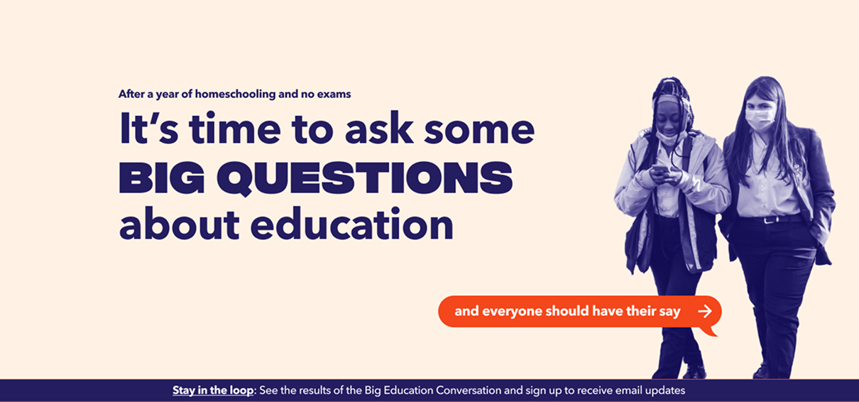
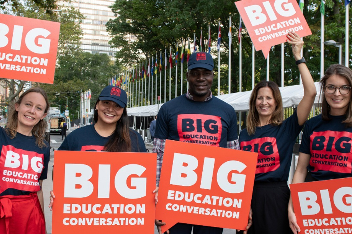
Big Education Conversation
We designed the brand and built an interactive website for Big Education Conversation, a Big Change initiative engaging young people in reimagining UK education policy. Drawing on youth consultation research, we built digital actions - including an emoji-slider inspired by Instagram Stories - designed to make civic participation feel instinctive rather than institutional.
"The perfect combination of attitude, skills, and quality for our incredibly challenging project."
Caireen Goddard, Big Change
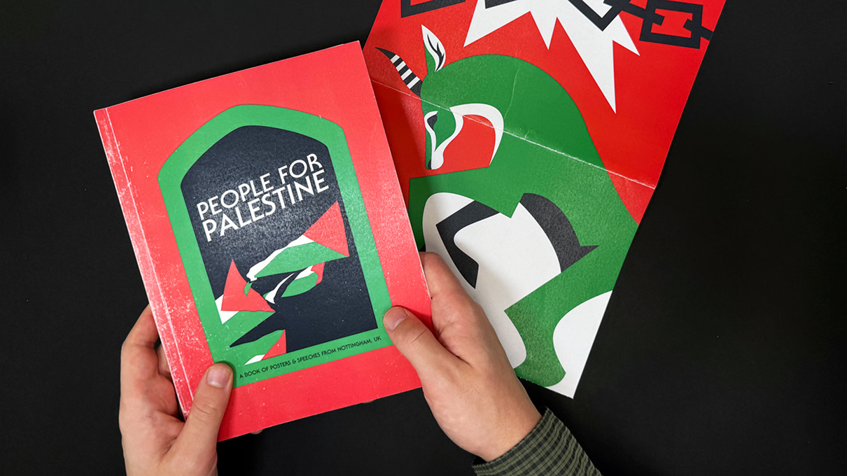
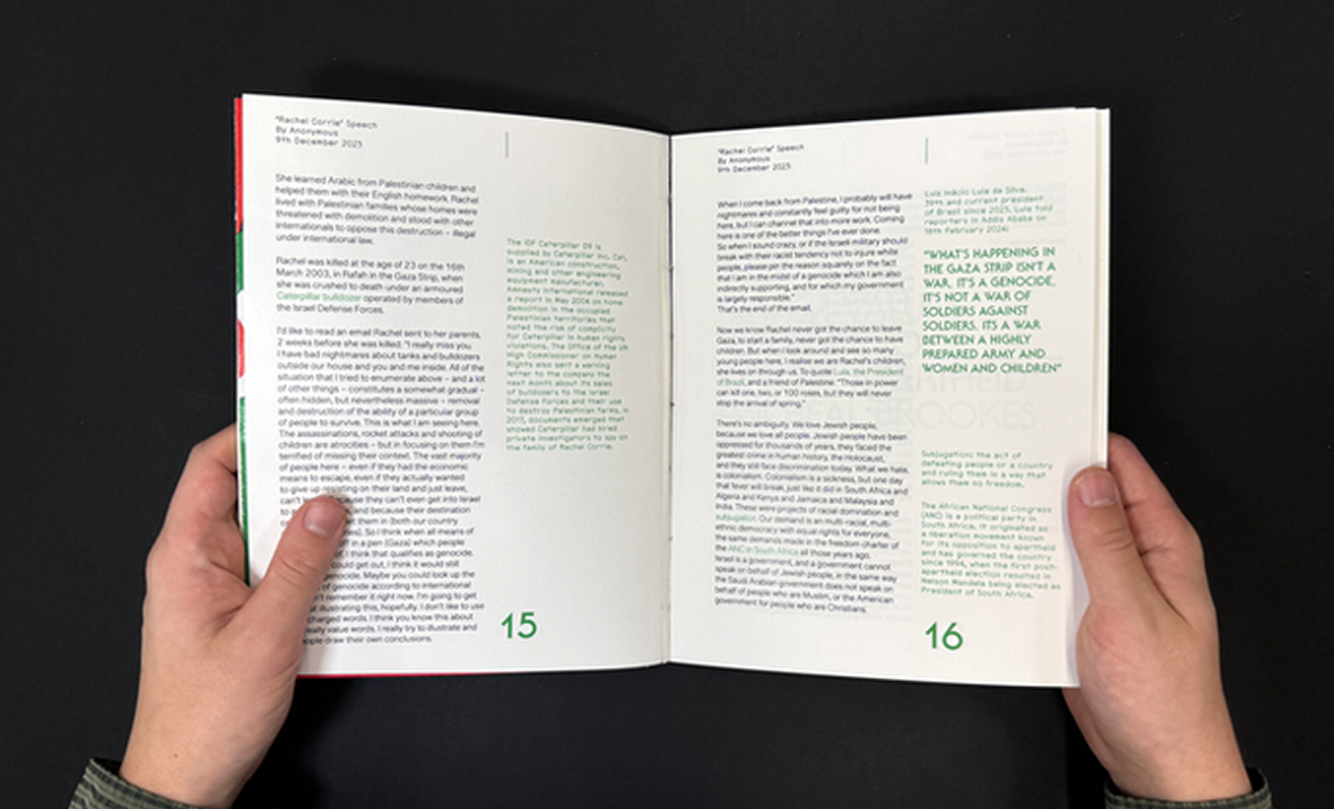
People for Palestine
We brought together a collective of Nottingham-based artists, writers and activists to create this 36 page book. People for Palestine serves as a call to action, encouraging you to reflect on the impact of collective efforts and discover the many ways one can contribute to meaningful change.
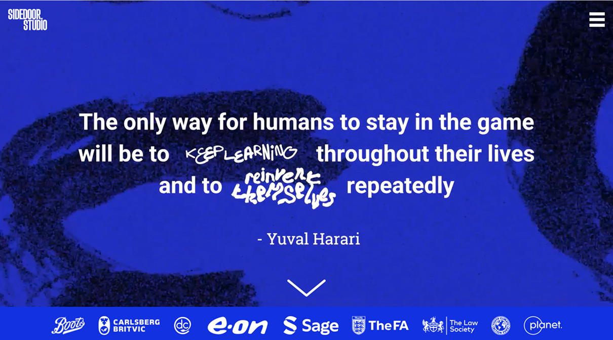

Sidedoor Studio
Sidedoor Studio are a Nottingham-based learning and development agency - supporting companies to upskill their staff. We worked to turn their brand into an engaging new site that their team can edit with ease.
“Creative, insightful, professional and so positive to work with. I can’t recommend Solidarity Studio highly enough.”
Si Beales, Founder of Sidedoor Studio

Reunite Families
Action Network fundraising and digital mobilisation set up for small charity combatting the UK’s unfair visa rules. We worked with mobilisation expert Paul De Gregorio and copywriter Chloe Green to map out and create a journey that turns passive supporters into engaged backers and donors.

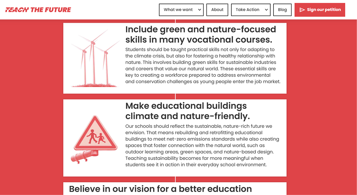
Teach the Future
We designed and developed the brand and website for Teach the Future, a youth-led campaign pushing for climate education reform across England, Scotland, and Wales. Built in Webflow with Action Network integrations, the site combined conversion-optimised content with a full supporter engagement ladder - moving people from signing petitions to writing letters. Within the first month, the campaign generated over 11,000 petition signatures and 2,000+ letters to MPs, MSPs, and MSs.
“Joe has a fantastic eye for impactful and engaging web design.”
Grace Corn, Project Manager at Teach the Future
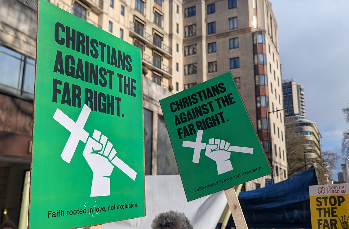

Christians Against the Far Right
We designed branding and posters for a new Christian initiative, organising against Christian nationalism and those trying to use their religion to divide, rather than unite.
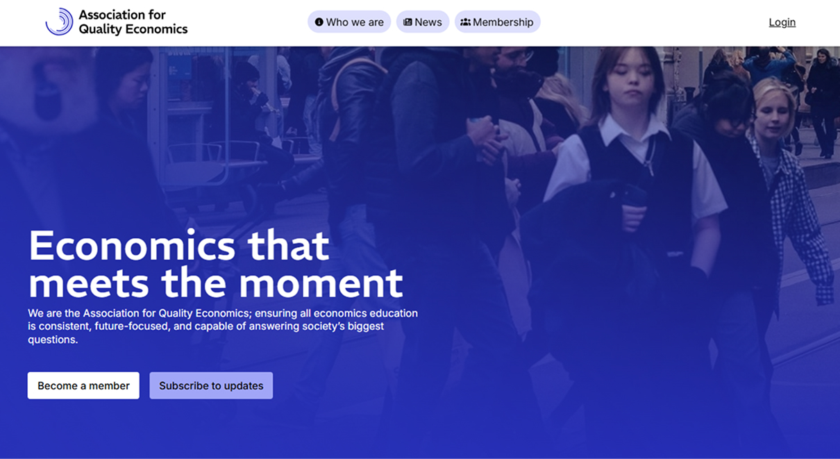
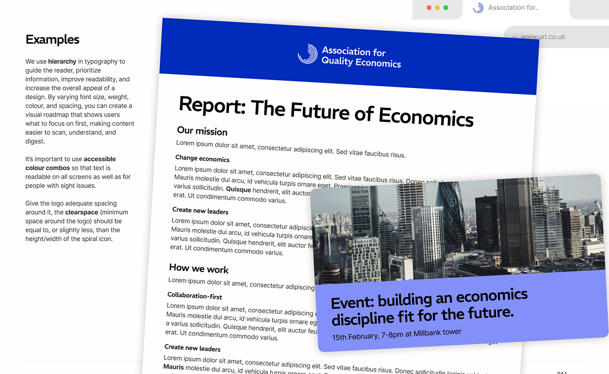
Association for Quality Economics
We developed the brand identity and website for the Association for Quality Economics, a professional body pushing for reform in how economics is taught and practised. The identity, built around a custom logo, a bold palette and a type system pairing authority with approachability, positions AQE as a credible challenger within the discipline. The website includes a bespoke membership portal to engage their community.

Sheff Events
We created the brand and ongoing social media design for Sheff Events, Sheffield's weekly roundup of independent nightlife - building a visual identity that's bold enough to cut through a busy feed while staying true to the city's DIY culture.
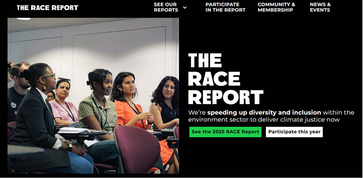

The Race Report
Working with Studio Sana, we developed a brand and website for The Race Report, a racial diversity project in the environment sector, which included presenting complex stats in simple visual form.
“We couldn't be happier with the outcome! It has allowed present ourselves in an accessible and appealing way.”
Rachel Drayson, head of Research and Impact at Students Organising for Sustainability UK
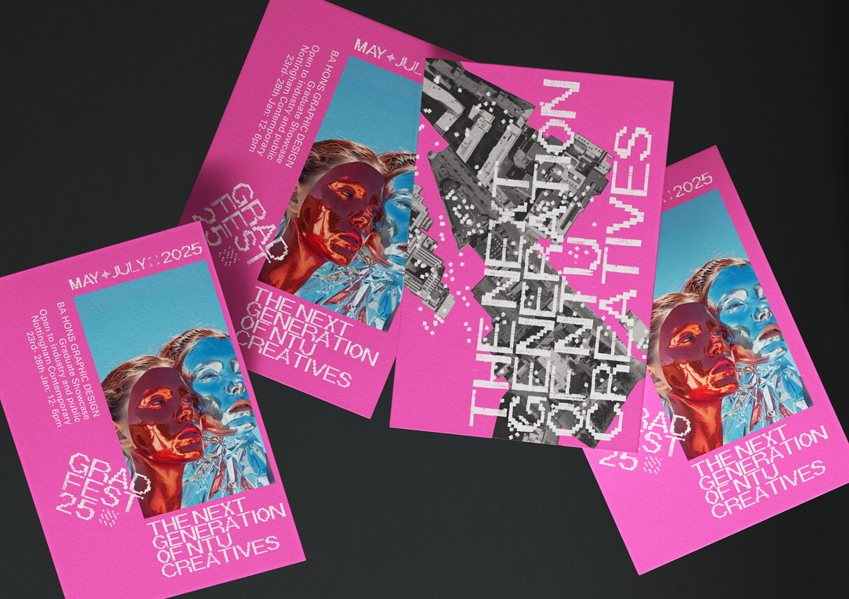

Nottingham Grad Fest
We created branding and an art submission for Nottingham Grad Fest 2025, the annual celebration of graduating students from Nottingham School of Art & Design - developing a visual identity that matched the energy and ambition of the work on show.

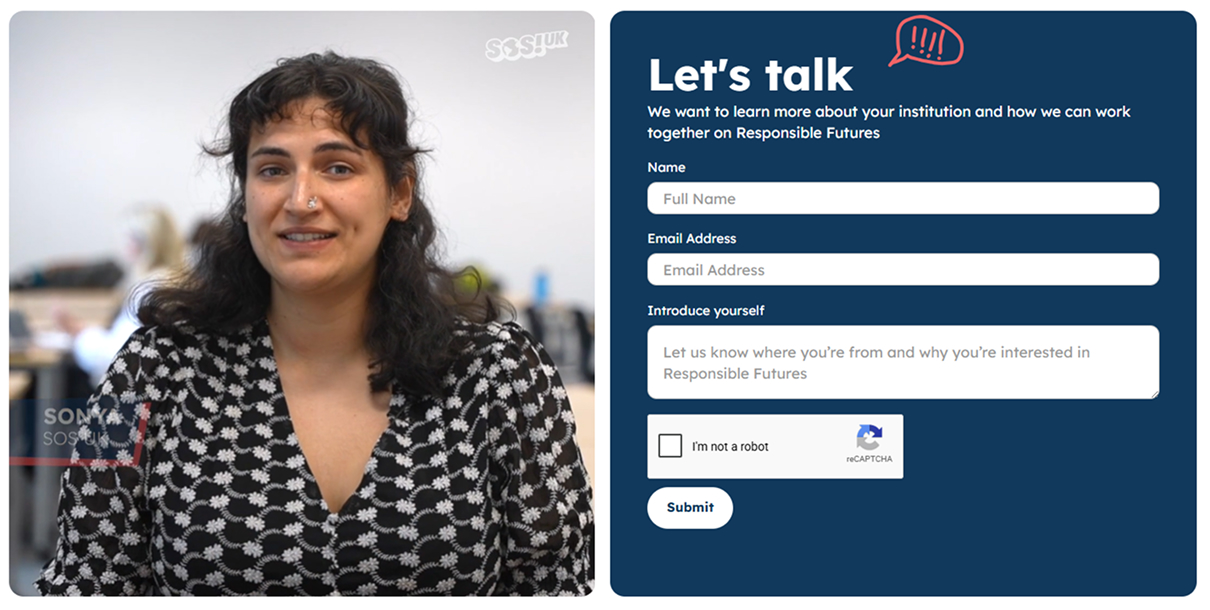
Responsible Futures
We designed and developed a website for Responsible Futures, a university sustainability accreditation programme, building a clean, accessible platform to help institutions understand and apply for the award.

Lewis Dagnall for South Yorkshire Mayor
We designed and built a campaign website for Lewis Dagnall, Labour's candidate for South Yorkshire Mayor, structured around converting visitors into active supporters and volunteers.
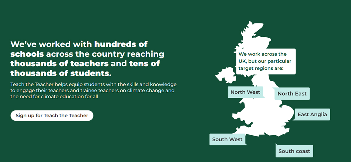
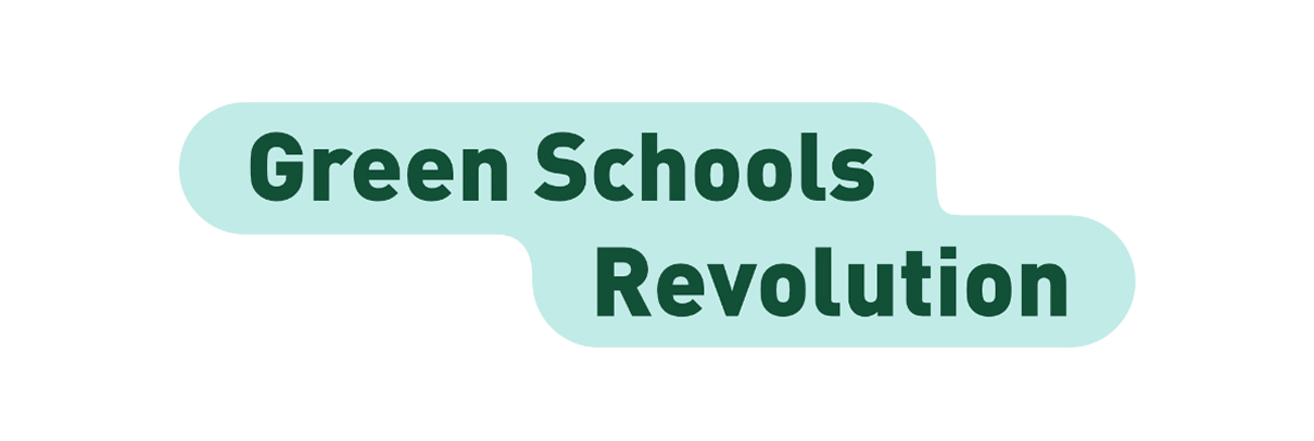
Green Schools Revolution
We designed and developed a website for Green Schools Revolution, creating a platform to showcase and celebrate sustainability projects happening in schools across the UK - making it easy for teachers, students, and partners to discover and share what's working.
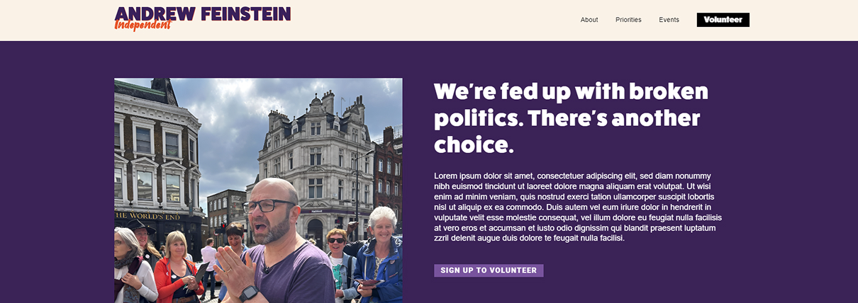
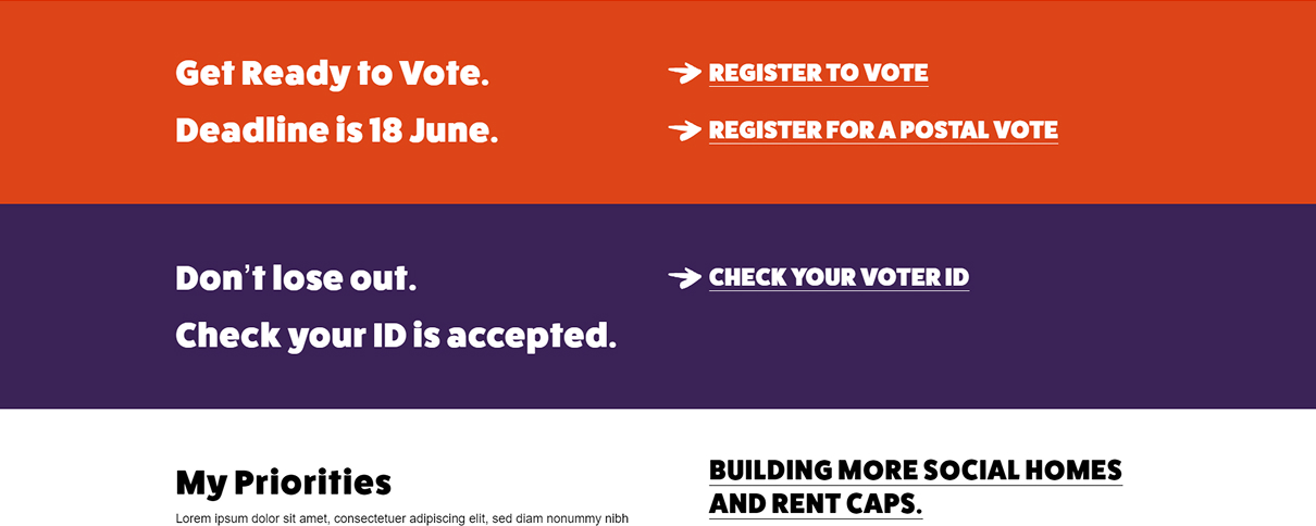
Andrew Feinstein, independent for Holborn and St Pancras
Website for independent parliamentary candidate Andrew Feinstein, legendary anti-war campaigner and former MP for the ANC in South Africa.
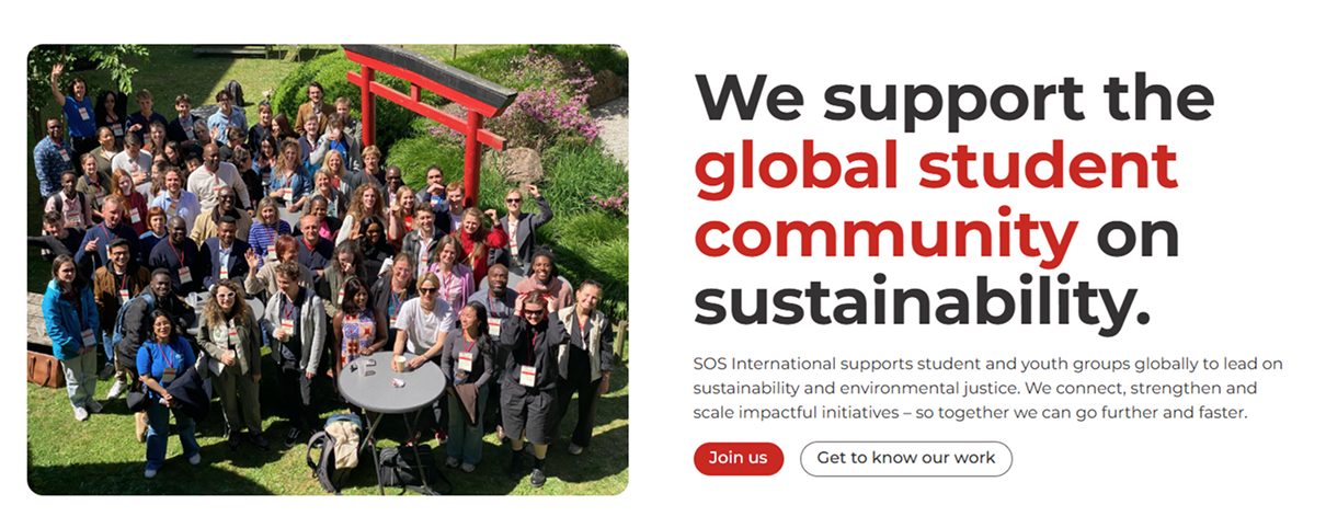

Students Organising for Sustainability International
Website redesign and development with CMS and Action Network integration for global student organisation.
Let’s talk
Interested in hearing more about what we do?
Got an idea for how we can work together?
Send us an email at hello@solidaritystudio.uk


Solidarity Studio
For the change-makers, the community-builders, the culture-shifters, and the joy-bringers.